RESULTS ANNOUNCEMENT
We are proud to announce the Japan Foundation, Kuala Lumpur have successfully organised the inaugural “Furoshiki Design Contest” open to all arts and designs students in Malaysia aged 18 and above. Out of the overwhelming 136 submissions received, and after a long discussion, the judges have agreed and selected 3 winners for this contest. Congratulations to the winners and participants for their wonderful submissions and unique interpretation of the theme “Malaysia+Japan”. Read the judges’ comments on the three winning designs as well!
Here are the winning designs!
JUDGES’ COMMENTS
Dr. Debbie Gan Siew Siew:
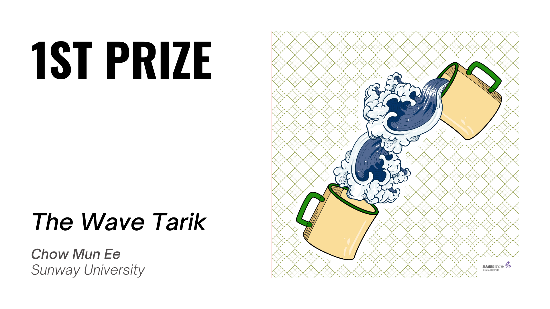
A clever piece of artwork that ‘fuse’ The Wave pattern into the process of making “Teh Tarik”, both uniquely Japanese and Malaysian. Other cultural design elements has been incorporated in the Furoshiki so effortlessly. A unique and contemporary take on Furoshiki design.
Nik Faiz Nik Amin:
This is the best representation of “less is more” when the designer has successfully achieved the level of subtlety in her design, with a strong narration on both Malaysia and Japan.
Nini Marini:
Mun Ee’s design is simple yet impactful and quite meaningful. The chosen images of Malaysia’s most loved drink, the ‘teh tarik’ is represented with the use of classic cream coloured cups often used by the tea puller in street stalls, This is then combined with the legendary ‘great wave’ (s) from Japan, emerging dynamically from the cups in harmony clearly states the two cultures without much explanation. The image is positioned in the centre of the fabric as a focal point in a “toasing” action; a celebration of the two countries and the respect each has for each other. The use of the ketupat design element in the background stitched together with dotted lines inspired by shashiko, the traditional embroidery design unified by white in the background to represent unity and purity further enhances the story of the intended union of the two countries. Overall the design is youthful, free from the confines of trying to emulate the traditionally full designs of the furoshiki cloth which I thought was a nice way of making it contemporary. I think it lends a great message to whoever gives or receives this furoshiki.
JUDGES’ COMMENTS
Dr. Debbie Gan Siew Siew:
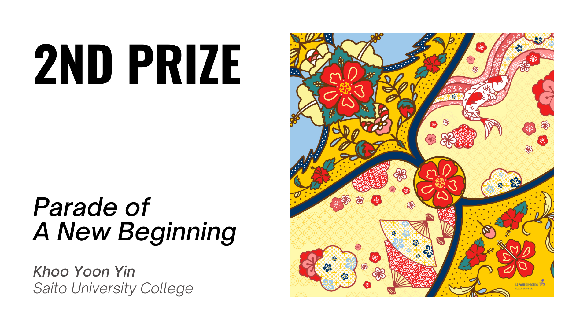
A melange of cultural visual elements showcase in one colourful and attractive piece of Furoshiki!
Nik Faiz Nik Amin:
The design speaks harmoniously with a good colour composition, and the asymmetrical composition of the wau bulan expresses the furoshiki’s versatility.
Nini Marini:
Yoon Yin’s choice of the classic wau bulan (kite) in flight paired with the textile elements from Japanese ornaments on the surface may seem obvious however the detail and care to harmonise is to me what makes this design delightful. The wau is seen flying freely in the air, floating in “Japanese” air decorated with elements synonymous from the country. The colours chosen; primary colours from Malaysia and the softer pastel shades of Japan is also a lovely complementary aspect. I can imagine that this furoshiki when wrapped, would look vibrant in any which way it is used further punctuating this story of harmony.
JUDGES’ COMMENTS
Dr. Debbie Gan Siew Siew:
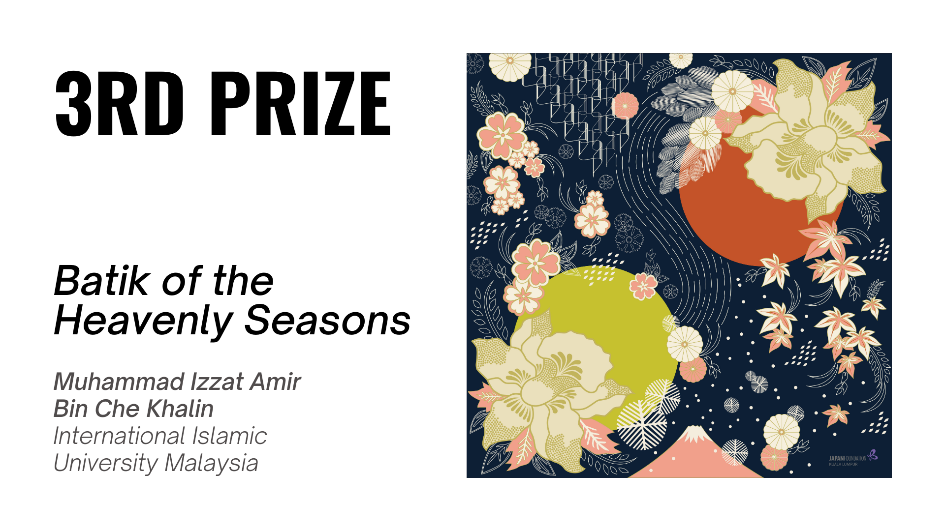
Cultural design elements well composed throughout the 4 seasons creating a balance piece of artwork which is truly Japanese-Malaysian.
Nik Faiz Nik Amin:
Although the composition might be of a normal Japanese pattern, this artwork contains an extremely interesting character of Malaysia translated into Japanese design language.
Nini Marini:
Muhammad Izzat shows respect for the Japanese culture by acknowledging the changing of seasons. It is something that is not usual in tropical Malaysia. He merges Malaysia by using batik elements to tell his story. There is deep reflection and philosophy in his design that is expressed in the symbols used. It is all about the details which is also a nice way of showing respect to the nature of the Japanese as a whole. He has also paid homage to traditional Japanese design through the use of colour (deep blue and pastels in) juxtaposed with precise lines and symbols. Just like Malaysian batik, the more you understand the symbols used and the meaning behind them, the more stories it will tell you which I thought was a wonderful subtle way of unifying culture through design.
*All results are final and non-negotiable. The winners will be contacted by the organiser regarding the prizes.
|
UPDATE (as of 28 February, 5:00 PM)
The submission for this contest has closed. Thank you so much to everyone who submitted. Stay tuned for updates on our channels very soon.
|
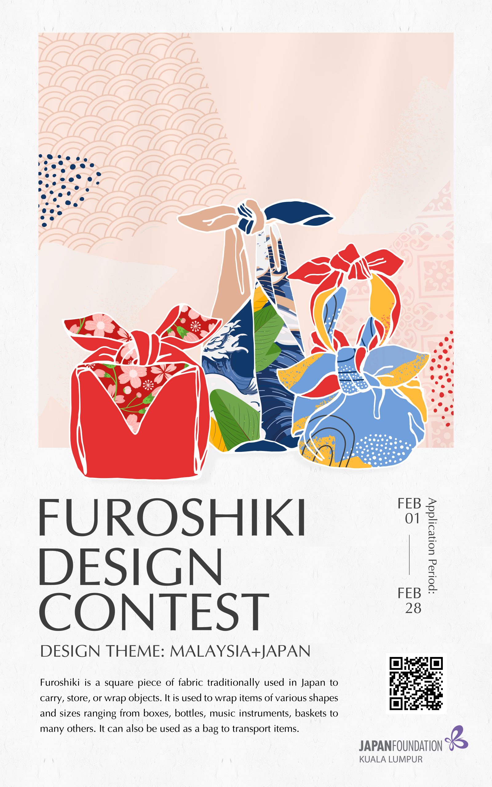
The Japan Foundation, Kuala Lumpur is proud to announce “Furoshiki Design Contest”!
WHAT IS FUROSHIKI?
Furoshiki is a square piece of fabric traditionally used in Japan to carry, store, or wrap objects. It is used to wrap items of various shapes and sizes ranging from boxes, bottles, music instruments, baskets to many others. It can also be used as a bag to transport items.
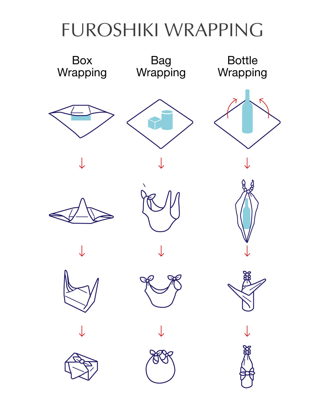
Modern furoshiki can be made from a variety of fabrics including silk, chirimen, cotton, rayon, and nylon. The dimension of a furoshiki can range from hand-sized to larger than bed sheets.
Over the years, the usage and popularity of furoshiki declined as department stores and supermarkets started providing paper and plastic bags to their customers. However, it has regained its popularity as it is environmentally friendly and helps reduces the use of plastics.
OBJECTIVE
To showcase the talent and creativity of arts and design students in Malaysia by having them create a textile design for furoshiki by incorporating the diverse cultural elements of Malaysia and Japan.
THEME
‘Malaysia+Japan’
The design should evoke a fusion of Malaysian and Japanese cultural elements.
ELIGIBILITY
Open to art and design students who are currently studying either in public or private universities, colleges, vocational or any other educational institutions in Malaysia aged 18 years and above as of 1 January 2021.
APPLICATION PERIOD
1 – 28 February 2021
NUMBER OF SUBMISSION
Only one entry allowed per submission.
DESIGN GUIDELINE
Design size: 70x70cm, 300dpi, JPEG/PDF
The design should be for a square-shaped fabric, 70cm x 70cm in size, with a resolution of 300dpi.
Submission should be in either JPEG or PDF. Please apply the design on the template provided.
DOWNLOAD
1. Contest Guideline (PDF)
2. Entry Form (Word)
3. Template (ZIP, contains AI, PDF, JPG)
4. e-Flyer (PDF)
PRIZES
First prize: RM2,500 and certificate
Second prize: RM2,000 and certificate
Third prize: RM1,500 and certificate
JUDGES


